
Google has pushed another update to its Google Play Newsstand app in the Play Store just a month after it first introduced Material Design on it. The latest update doesn’t add any new features or any ground breaking changes, but merely adds refinements to the design. It completes the transition to Material Design that started with the last month’s update.
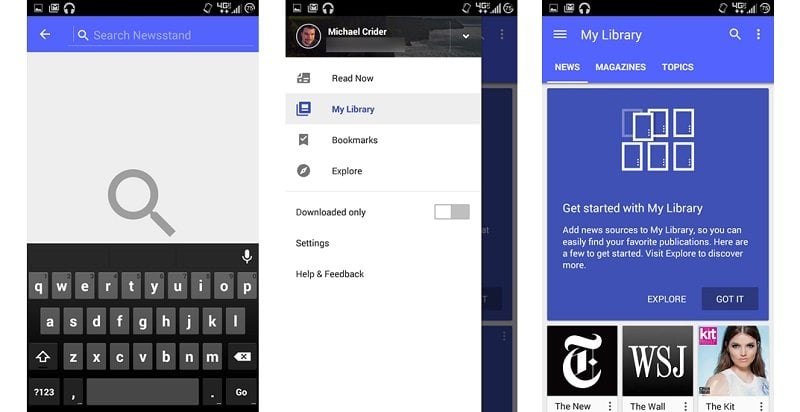
Among the first changes that you’ll notice are the new animations including the one that plays on tapping and dragging down on a list of news articles to refresh it. It now shows the Material Design’s circular arrow refresh animation seen elsewhere as well. Then, the pop up cards that show up occasionally now feature full color backgrounds instead of the just the top half that used to be colored before. There are other changes as well, like the selections on the hamburger menu now appearing in thematic blue instead of earlier black, a thicker magnifying glass icon, and the option to view “Downloaded only” being moved from the drop-down menu to the side menu.
Overall, it seems like a refinement of the previous update, making small changes that ad to the experience. You can grab Google Play Newsstand from the store link below.
Google Play Newsstand – Android
[via]