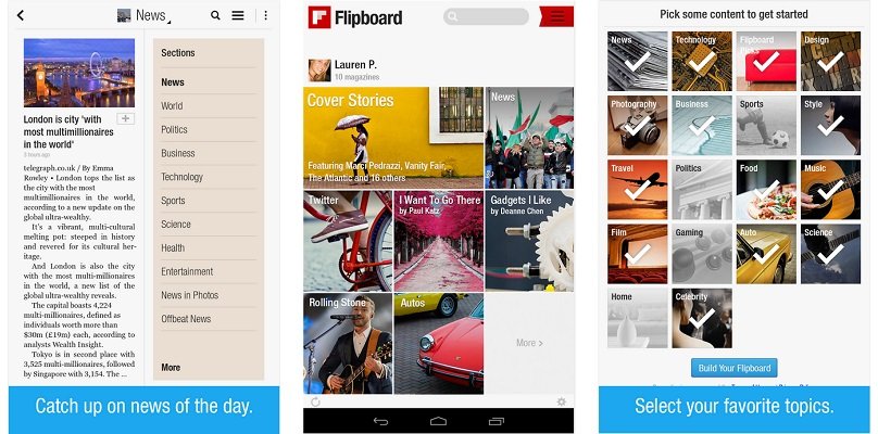
While everything seems to be moving towards the Material Design on Android, Flipboard begs to differ. The app has been updated on Android with a brand new design that doesn’t look anything like the Material Design. It seems to make the navigation on the site much easier and the app looks less cluttered now. For mobile users, there’s a new top tab bar that allows you to easily navigate between your profile, things you’re following, search and notifications.
Besides the appearances, the app now offers some 30,000 new topics to follow and keep you busy on the app. For people who don’t get a lot of stuff through their social feed, the app offers daily curated content in The Daily Edition. You can also follow people in the Flipboard team curating this content.
Grab the app in the Play Store at the link below.
Changelog for Flipboard v3:
• Start your day with The Daily Edition, with articles selected by our team at 7 a.m.
• Follow people to stay up-to-date on what they’re collecting into their magazines.
• New design, everywhere.
On phones only:
• New top tab bar to quickly navigate between your Flipboard, everything you’re following, search, notifications and your profile
