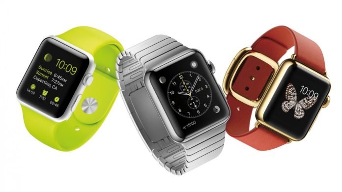
I’m not even sure we can call it a watch. Okay, it goes on the wrist, and it happens to tell the time, but that’s about where the similarities between Apple’s just announced watch and the hand-assembled, often painstakingly finished mechanical watches we write about, and obsess over, end. I was lucky enough to be invited to Cupertino to witness the announcement of the Apple Watch firsthand, and though I do not believe it poses any threat to haute horology manufactures, I do think the Apple Watch will be a big problem for low-priced quartz watches, and even some entry-level mechanical watches. In years to come, it could pose a larger threat to higher end brands, too. The reason? Apple got more details right on their watch than the vast majority of Swiss and Asian brands do with similarly priced watches, and those details add up to a really impressive piece of design. It offers so much more functionality than other digitals it’s almost embarrassing. But it’s not perfect, by any means. Read on to hear my thoughts on the Apple Watch, from the perspective of a watch guy. Oh, and there are dozens of in-the-metal pictures, too.

I won’t get into the raw functionality of the Apple Watch – for that, refer to my colleague Kelly Jasper’sintroductory article here. Instead, I’ve chosen to focus on the many things I believe Apple got right and those I believe they got wrong, all the while viewing this piece of wearable technology not as a digital peripheral, but as an actual watch. Essentially, what our friends in Switzerland can learn from Apple, and what Apple can learn from the Swiss.
WHAT’S GREAT ABOUT THE APPLE WATCH
Feel
The overall level of design in the Apple Watch simply blows away anything – digital or analog – in the watch space at $350. There is nothing that comes close to the fluidity, attention to detail, or simple build quality found on the Apple Watch in this price bracket. The Sistem51, for example, is a very cool, inexpensive mechanical watch. But it feels like it costs $150 (for the record, I bought one and adore it). Then, for closer to the price of the Apple Watch, you could own this, which is, well, downright horrific in just about every conceivable metric. Seiko does offer some nice things at $349 or less, but again, they feel like they cost exactly what they do. The Apple Watch feels like a lot of thought went into it, and no doubt it did. It feels expensive.

Finish
Overall design of the object – most obviously, the way that curved screen flows perfectly into the case – is just gorgeous. As Tim Cook said during the keynote address, you can barely tell where the software stops and the hardware begins. The rounded edges are very Apple, even very Marc Newson, who, based on absolutely nothing but a gut feeling, I’m sure had something to do with the design of the Apple Watch. Why? Just look at it. Also, take a read of this article I wrote back in 2012 when Newson’s Ikepod showed its then new Horizon. I call attention to the fact that the bezel is seamlessly integrated into the case. Not dissimilar to the way the screen of the Apple Watch wraps into the body. And the strap found on the Apple Watch Sport? Look at the strap from the Newson-designed Ikepod. Jony Ive’s friendship with Newson is well documented and it’s possible they simply shared ideas over drinks, or maybe Newson was entrenched in the project, imparting all he learned at Ikepod with his friends at Apple prior to the announcement he’d join their ranks. We will never know.
Restraint

The Apple Watch is available in both 38 mm and 42 mm. I tried them both on, and they both worked perfectly on my wrist. They didn’t exaggerate the options and make one decidedly male oriented at 44 mm and a girly equivalent at 35 mm or the like. Any man, woman, or child could pull off either size with ease. This may not seem like much, but remember this is Apple’s first watch, and it would be a very easy mistake to make it too big or too small. I’m sure there was much discussion about making it larger – how could there not be? It would’ve made the entire interface bigger, bolder, more recognizable from afar and easier to use. The fact that they chose to actually make the thing wearable shows a great deal of restraint. The 38 mm example is particularly nice on the wrist…click here to read the rest of the story.